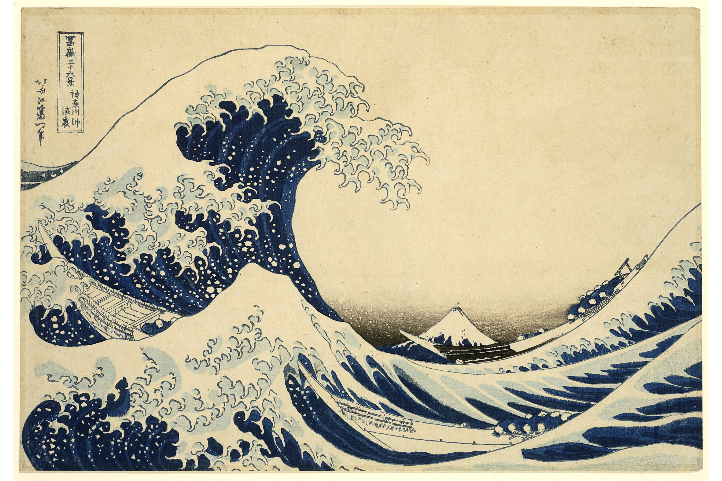
Behind the Wave off (the Coast of) Kanagawa
1830
Signed: Hokusai aratame I’itsu hitsu; ōban, yoko-e, 25.5 x 37.5 cm; nishiki-e with fukibokashi
Print 1 from “36 Views of Mount Fuji”. Hokusai was almost 70 when this world-famous work was created. A close examination of this print recently showed it to be a later edition. Three printing blocks (colours) are missing, and one of the blocks was reworked. Although Hokusai was well aware of the importance of his work, the success of the Fuji series did surprise him, since originally only 36 different prints were planned, and eventually 100 were produced.
F. Tikotin, La Tour de Peilz (March 1964)
Riese Collection #119
The “Great Wave” presents three problems to its owner or viewer. First, how fine and early is the impression. Second, when was the print designed? Third, what did Hokusai intend? The answer to the first question varies of course, from impression to impression. Much is usually made of the presence or absence of a pink or yellow cloud in the sky. In deciding whether a print is an early or a late impression it is wisest first to examine the thinnest lines of the keyblock, on this print the lines surrounding the cartouche. They are intact and show that the print is early, testimony which is confirmed by the printing elsewhere. The outer line on the left has only just begun to wear, whereas large positions of it are conspicuously absent in later impressions. The Great Wave, while never rare, has always been esteemed among western collectors, and has always been the print that a proud owner would frame to hang upon his wall. The result has been that a large pink cloud that filled most of the upper third of the print in most, if not in all impressions, faded. Japanese prints were printed with two kinds of pigments. The inorganic mineral pigments were stable and altered very little when exposed to light or atmospheric conditions. The organic pigments were very sensitive and changed in two ways. Certain colours, like pink and yellow got paler and paler as they were exposed to light. Others like the blue and purple of the late 18th century changed their quality completely, and changed from their original tones to buff and brown, also becoming paler with the passage of the time. A careful examination of the Riese impression shows the dim outlines of the pink block, now completely bleached and faded. Likewise there are traces of yellow printed on the boats which originally were bright, warm, sunny tone, in contrast to the cold blue hollows of the waves.
The second question has yet to be satisfactorily answered. This print announces that Hokusai is changing his name from Hokusai to Iitsu. Other prints in the set reverse the formula and say that they were designed by Iitsu, who formerly used the name Hokusai. According to Japanese authorities who have examined paintings and dated surimono, Hokusai began using the name Iitsu in 1822. On the face of it, a print announcing his change of name should rightfully be designed that year. However the blue which is used so extensively in this and other prints in the series, the “Prussian blue” an intense mineral pigment that gave impetus to the flowering of the landscape print, does not seem to have been introduced until later in the 1820s. Writers caught between this Scylla and Charybdis have tended to split the difference and propose a date of 1825, more or less, for the series to begin, and suggest that it carried on over several years until the beginning of the 1830s when Kuniyoshi, Hiroshige, Eisen and other artists began designing landscape prints. This theory is unsatisfactory. Ukiyo-e artists never worked in a vacuum. Considering the explosion of lacquer prints in the 1720s, of full-colour prints in the late 1760s, of large heads of actors and courtesans in the 1790s, it is inconceivable that Hokusai could have been designing prints as dramatic, and to judge from the number of late impressions of the best designs, as popular as those in the Fuji series, without provoking some sort of immediate response from other artists. Inconceivable that Hoeidō, with a success of this magnitude on his hands in 1822 or 1825 would have waited nearly ten years before commissioning Hiroshige to design the first Tōkaidō. I would propose that Hokusai, who for twenty years had practically given up commercial print design, concentrating instead on illustrated books, painting, and surimono, returned to the popular arena around 1830, seizing on the possibilities of the new blue mineral dye, and began designing views of Fuji which were published as quickly as they could be engraved. I would suggest that since Hokusai’s last commercial prints had been signed Hokusai, and that this was the name by which the Edo public knew him, since his name change had been announced only on privately commissioned paintings and surimono, that he felt called upon the announce a change of name on earlier prints in the series, and repeat on later subjects that although he called himself Iitsu, his public should remember that he was after all the same Hokusai they remembered and admired.
The third question has usually been answered in terms of platitudes taken from translations of Chinese philosophy: that Hokusai was expressing the perilous intimacy between man and nature, the precarious balance, the perception of which is at the very basis of the oriental soul. Well this may be. Hokusai was little given to philosophising for posterity, but his print is an eloquent image of just such an intimacy, and just such a precarious balance. But to dismiss the picture as the expression of a thought, however appropriate or profound, is to diminish the genuine force of the design; what Hokusai probably felt was its real virtue, in the original sense of that intense word: its strength, its power.
I would propose that the virtue of this print, its true success, lies in its unrelenting geometry. Ukiyo-e artists did not compose by impulse, the tranquillity of a Hiroshige or a Harunobu is not a happy accident, and Hokusai, perhaps the most intellectual of all the ukiyo-e artists, often repugnant in the remoteness of his curious abstractions, here was able to fuse his genius for distant, geometric form with the protean teeming wealth of images his mind presented him, rather than letting one predominate, as in other odder prints of Fuji, or as in the Manga, simply scatter.
Other impressions of this print have been reproduced too frequently to mention.
This impression is reproduced in: Ingelheim catalogue, no. 102.
Riese, Asiatische Studien, 1972, p. 112, no. 33.